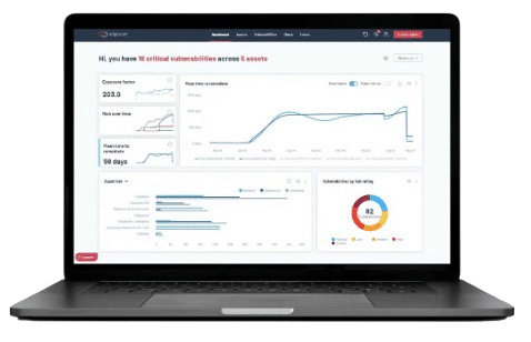
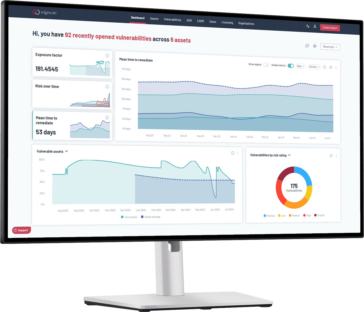
We are delighted to announce that the new Edgescan user front-end interface will be released next week, and we’re really excited to get it in front of our customers. So what can you expect when you log in?
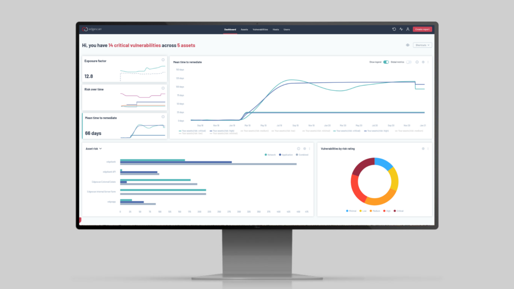
A cleaner design
- We’ve spent a lot of time designing a cleaner interface, with better use of space and colour to reduce noise, and this effort is visible on every page. We’ve also written an extensive component library to allow us to rapidly build new functionality going forward.
- We’re grateful to design partners who worked closely with us to create our design language.
Dashboard
- Our revamped dashboard combines the best parts of our old dashboard and metric pages. We’ve designed it to show you your current security posture – and your progress towards improving it – at a glance.
Easier Reporting
- We know how important reporting is to our customers, and now it’s never more than a click away.
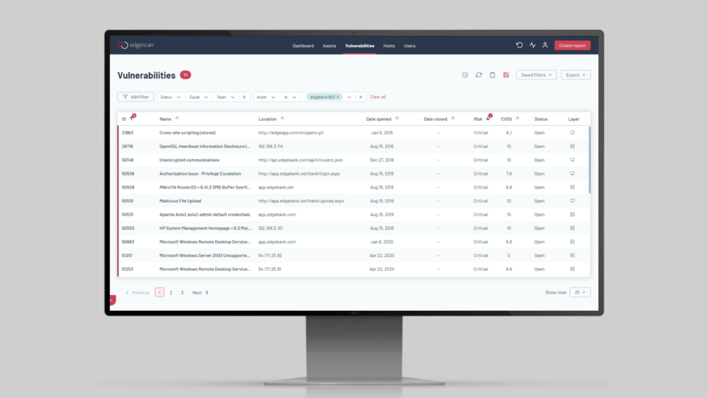
Improved filtering for assets
- We know that many customers need more tools to manage their assets, so we’ve made our powerful querying functionality available on the assets page. Want to see which of your authenticated assets are currently being scanned? Now you can.
Saved Filters
- You can save your most commonly used filters for the asset, vulnerability and host pages. Your saved filters are only a click away on the dashboard, placing the information you need at your fingertips.
This release is the culmination of a year of hard work by our core team. We started this project with the aim of delighting our customers, and building a firm foundation for the future, and we’re very proud of the result. We’re sure our users love it as much as we do!

